Sliders are a modern way to feature content on your Advanced pages. There are options for sliders with one image showing at a time, three images showing at a time, one video showing at a time (through a YouTube video embed) and a rotating sponsor slider. An example of each slider can be found on the slider section of the advanced layout page.
Slider Setup
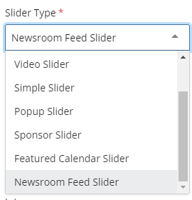
Select the type of slider you would like to build from the Slider Type dropdown box (details on how to build each slider are below in the following sections).
The rest of slider setup is for the Video Slider, One Slider and Three Slider options. If you are building a Simple Slider or Popup Slider you can skip these following steps. Sponsor Sliders function completely differently, skip to the Sponsor Slider section for more instructions. If you are looking to build a slider that feeds from the UNF Newsroom or events calendar you can skip to the Feed Slider section for more instructions.
- First make sure you have uploaded all your images needed for a slider before beginning (see the Inserting a Photo or Image section for more guidance).
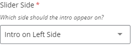
- In the Section Header add a header for the whole slider and if you have additional information place it in the Intro text box field.
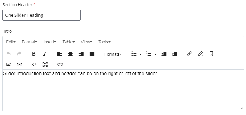
- In the Slider Side dropdown field go ahead and select whether you would like the Section Header and Intro fields to appear on the right or the left of the slider when in full screen (please note this will not display on mobile or with two columns, the Section Header and Intro will appear above the slider.
Creating a "One Slider" or a "Simple Slider"
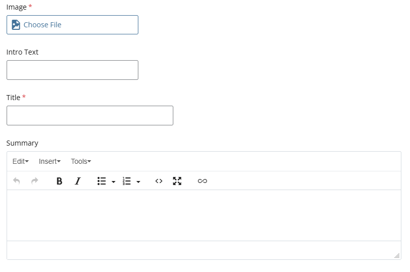
The "One Slider" and "Simple Slider" options allow you to feature content on your page by creating blocks with content and images. You can have anywhere from 1-9 slider blocks with an image, title, description, date/time and button link.
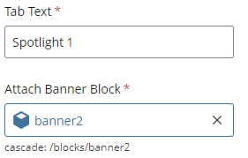
- After selecting One Slider or Simple Slider from the Slider Type dropdown menu, you will see a new Slider Block group created.
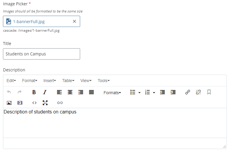
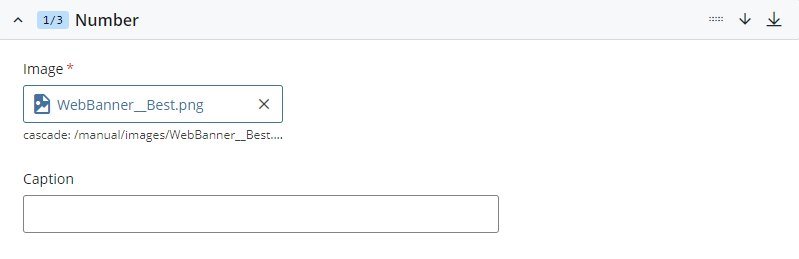
- Within the Slider Block group, you will attach your image to each block in the Image Picker. You can then add additional information to each slider block within the Title field and Description text box.
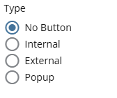
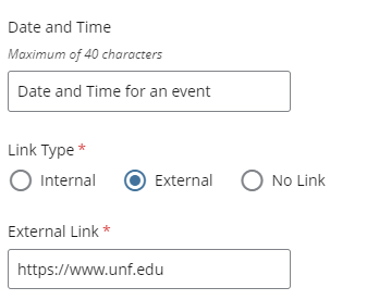
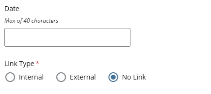
- You then have the option to add a Date and Time for the slider block if it is an event. Next you can add a button link to the slider block by selecting a type from the Link Type radio buttons and either typing in the link URL or navigating to the page internally.
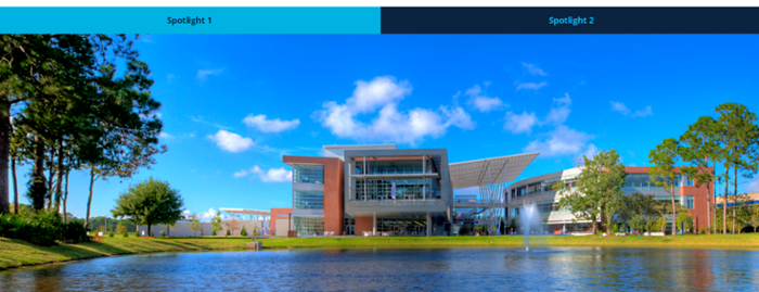
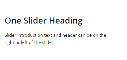
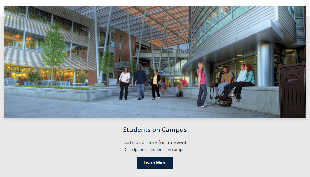
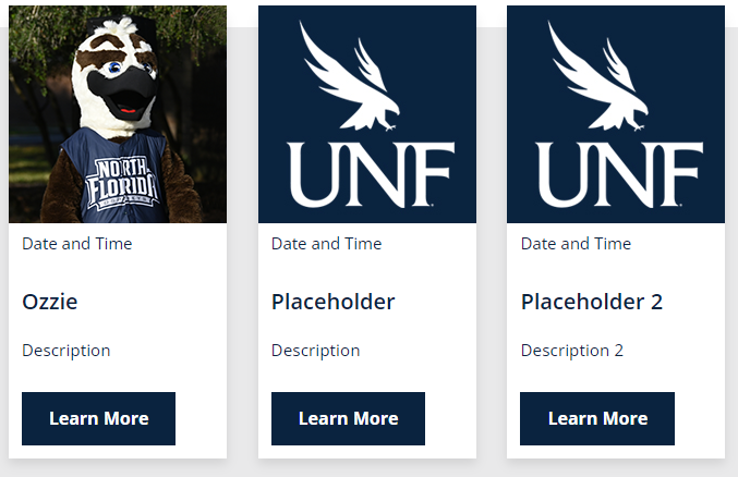
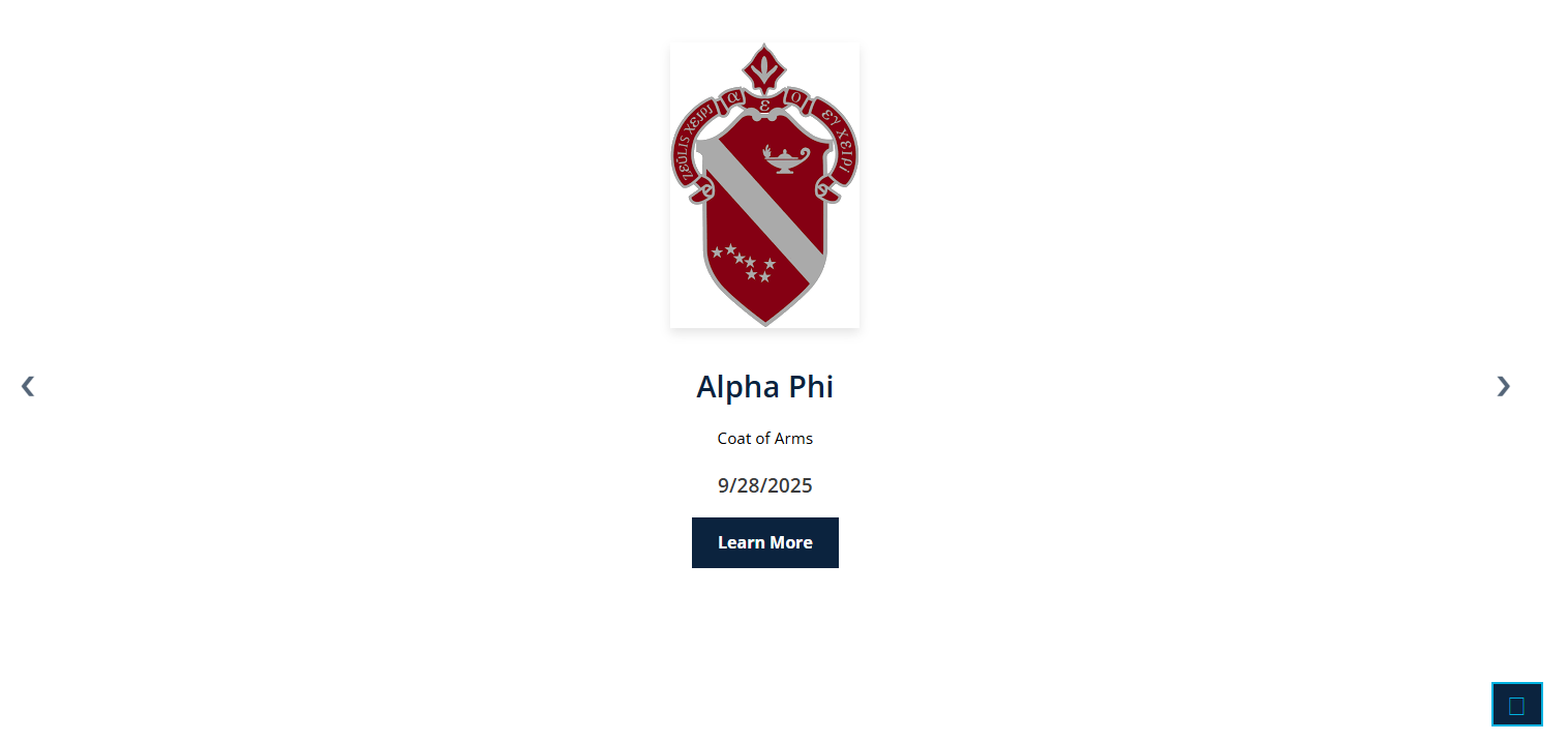
- All this content built out will design a slider block that looks like this image below featuring the image from the image picker, date and time for an event, the description of the image or event and a learn more button linking to another page.
- Once you have finalized your slider block you can add more by scrolling up to the Slider Block group header and selecting the Green Add New Group + button.

- This will allow you to build more content and create a manually rotating slider.
- When more than one slider block is built buttons with carot symbols "<" ">" will appear on either side of the slider to allow for slider functionality.
Creating a "Popup Slider"
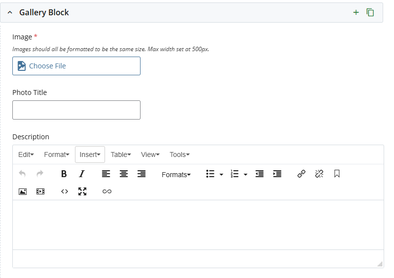
A "Popup Slider" allows you to feature image-based content on your page in a slider without worrying if all the images are the same dimensions.
- After selecting Popup Slider from the Slider Type dropdown menu you will see a new "Popup Slider" group, a "Slider Groups" group and three "Image Box" groups.
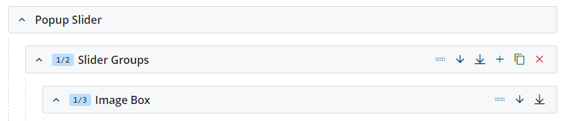
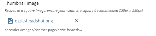
- Within your Image Box groups you can select a Thumbnail Image.
- Thumbnail Images are images that appear on the page in the slider (these should be formatted to 350px X 350px to avoid compression or stretching)
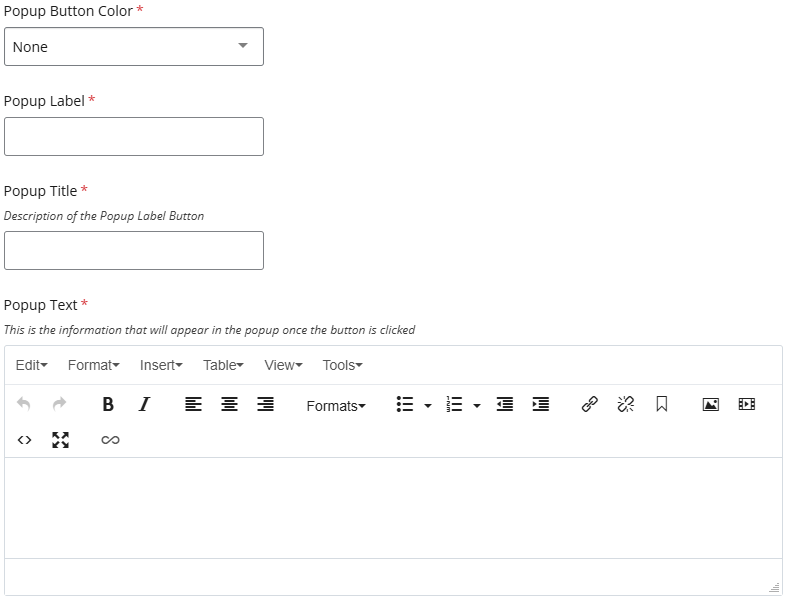
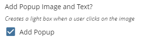
- You then have the option to Add Popup Image and Text by clicking the Add Popup checkbox.
- When adding a popup you will have the option for a Full Size Image that can be any dimensions you need and a Caption to go along with the image.
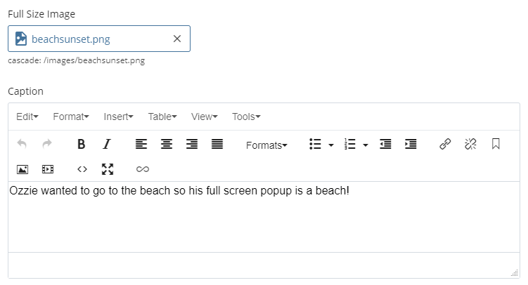
- Users will see this Full Size Image and Caption when they click on a Thumbnail Image in the slider with a popup.
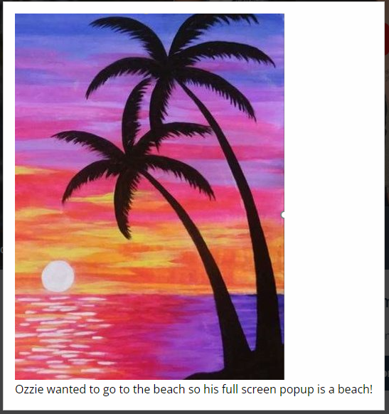
- An "X" button will appear in the top right of the browser allowing people to close the popup, clicking outside the popup box will also close the popup.
- Repeat this process for all three Image Boxes, if more Image Boxes are needed the green plus on the Slider Groups section can be hit to add three more Image Boxes in a new Slider Groups container.

- You do not need three filled out Image Boxes in a Slider Group, if you do not add a Thumbnail Image no image will be added to the slider.
Creating a "Three Slider"
A "Three Slider" allows you to feature content on your page by creating groups of blocks with content and images. You can have any multiple of 3 from 3-15 slider blocks with an image, title, description, date/time and button link.
- After selecting Three Slider from the Slider Type dropdown menu, you will see a new Slider Groups group created with three Slider Block groups inside of it.
- Within each Slider Block group, you will attach your image to each block in the Image Picker. You can then add additional information to each slider block within the Title field and Description text box.
- You then have the option to add a Date and Time for the slider block if it is an event. Next you can add a button link to the slider block by selecting a type from the Link Type radio buttons and either typing in the link URL or navigating to the page internally.
- Repeat this process for all three Slider Block groups within your Slider Groups.
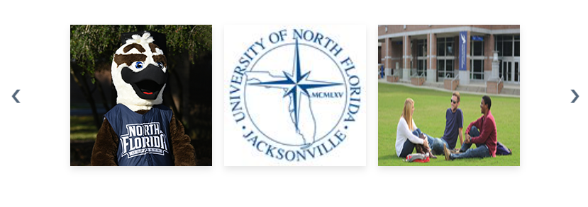
- All this content built out will design 3 slider blocks that look like the blocks in the image below featuring the images from the image picker, date and time for each event, the description of the image or event and a learn more button linking to another page.
- Once you have finalized your slider block you can add more by scrolling up to the Slider Groups group header and selecting the Green Add New Group + button.
- This will allow you to build more content and create a manually rotating slider with a new set of three Slider Block
- When more than one slider block is built buttons with carot symbols "<" ">" will appear on either side of the slider to allow for slider functionality.
Creating a "Video Slider"
A "Video Slider" allows you to feature content on your page by creating blocks with content and images. You can have anywhere from 1-9 slider blocks with an embedded video, title, description, date/time and button link.
- After selecting Video Slider from the Slider Type dropdown menu, you will see a new Video Slider group created.
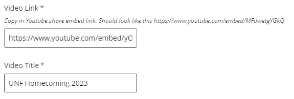
- Within the Video Slider group, you will attach your video embed link to each block in the Video Link box and add the name of the youtube video to the Video Title box. You can then add additional information to each slider block within the Title field and Description text box.
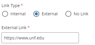
- Next you can add a button link to the slider block by selecting a type from the Link Type radio buttons and either typing in the link URL or navigating to the page internally.
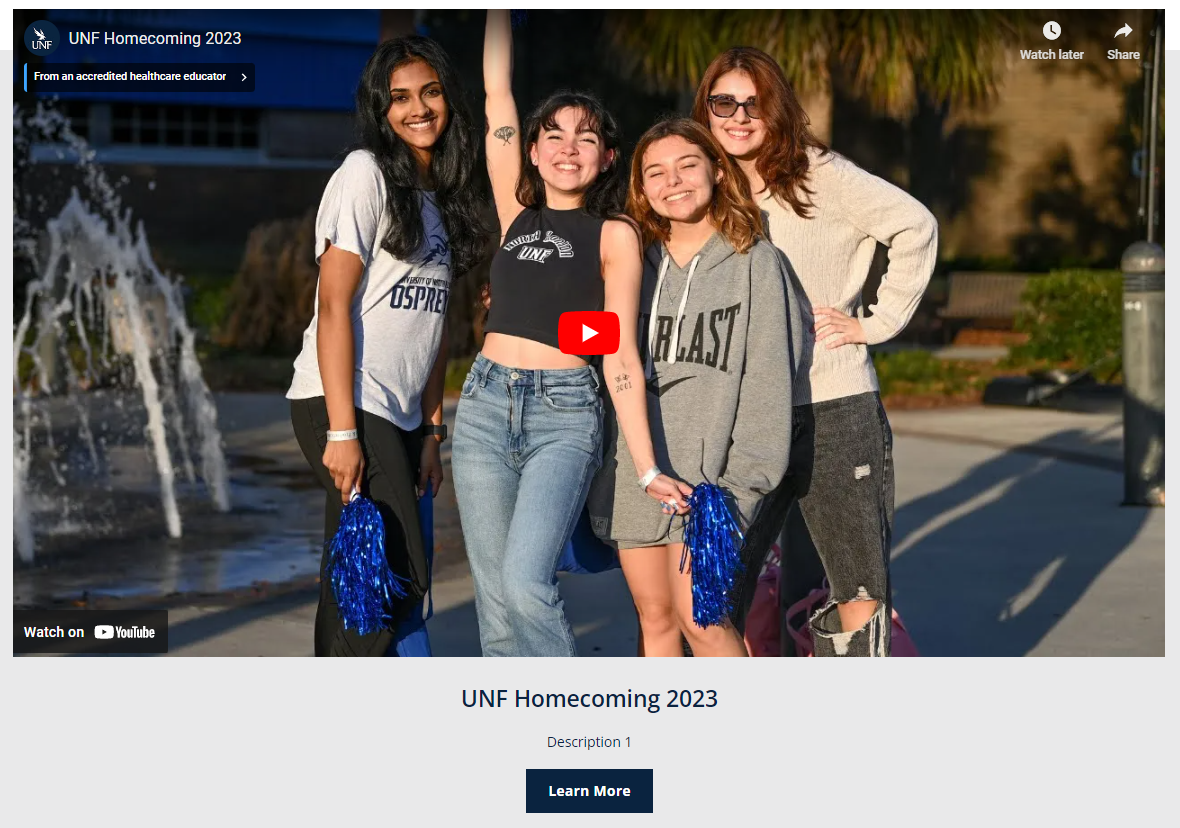
- All this content built out will design a slider block that looks like this image below featuring the image from the image picker, date and time for an event, the description of the image or event and a learn more button linking to another page.
- Once you have finalized your slider block you can add more by scrolling up to the Video Slider group header and selecting the Green Add New Group + button.

- This will allow you to build more content and create a manually rotating slider.
- When more than one slider block is built buttons with carot symbols "<" ">" will appear on either side of the slider to allow for slider functionality.
Creating a "Sponsor Slider"
A "Sponsor Slider" is a slider option that allow you to feature sponsors or partners of an event or department.
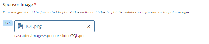
- Upload all of your sponsor images to Cascade before building your sponsor slider.
- All images need to be formatted to be 200px X 50px to ensure the slider functions properly.
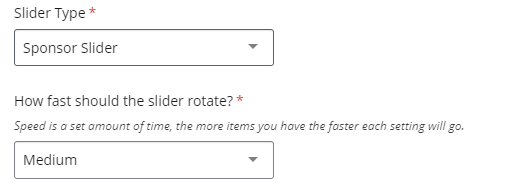
- After uploading images select the Slider option for Type from the tier dropdown menu. Under Slider Type select Sponsor Slider. You will then see a field titled How fast should the slider rotate? which is defaulted to Medium.
- Speeds are set as how long it takes for your slider to rotate through all the images. This means that the rate at which the slider rotates will vary depending on how many images you have as well as the speed you select. Time lengths for each option are listed below.
- Extra Slow = 100 seconds
- Slow = 75 seconds
- Medium = 50 seconds
- Fast = 30 seconds
- Extra Fast = 20 seconds
- After selecting your speed you will see five Sponsor Image fields, attach your images.
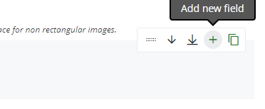
- You can add more images by hovering over the Sponsor Image selecting the green Add new field plus button.
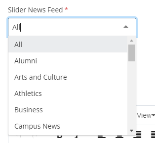
Feed Slider
The slider feeds are a way to pull in UNF Newsroom stories or events from the UNF Featured Calendar dynamically.
- Once you select Slider from the Type tier you will have the option for Featured Calendar Slider and Newsroom Feed Slider under Slider Type.
- After choosing your slider type you will have the option to choose which feed you want to use.
- Featured Calendar Slider options:
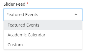
- Newsroom Feed Slider options:
- After selecting your feed type you will fill out your Section Header and Intro like any other slider option and after submitting the events or stories will automatically populate in the slider.

